Drawing Diagrams
When you open a new Process Diagram in Workflow, the user interface will resemble the following image:
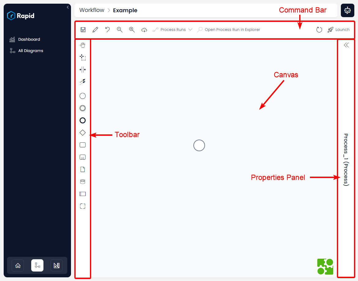
| Section | Explanation |
|---|---|
| Command Bar | Here is where the buttons for editing the Process Diagram as a whole exist. For example, the following buttons here are (from left to right): Save, Editing the process's Name and Details, Zoom Out, Zoom In, Download Diagram, Review Process Runs, Open Process Runs in Explorer, the Inline Refresh, and the Launch Process buttons. |
| Toolbar | Here are where the buttons for drawing the Process Diagram can be found. The specific buttons and their functions are discussed here. |
| Canvas | This is where the process diagram will be drawn. |
| Properties Panel | This is where each element in the Process Diagram can be configured or have its inputs and outputs scrutinised. To view an element in the Properties Panel, first click on the element on the Canvas. Clicking the background of the Canvas will cause the Properties Panel to display the properties of the entire process diagram instead. |
The Properties Panel can be revealed or hidden, using the double chevrons at the top of the panel.

Above: This icon will hide or expand the Properties Panel.
Adding Elements
Adding Elements via the Toolbar
-
Select the diagram element on the toolbar
-
You will notice that an orange element has now been attached to your cursor

- Now when you move your mouse, the shape will also move as well. Your cursor may also change to a fist, to indicate that it is "holding" the element you selected.

- Position the element on the Canvas, and then click to place it. Once the element is placed, the following will occur:
- The shape's outline will change from orange to black, indicating that it is no longer being positioned on the Canvas.
- A dotted outline will appear around the element, indicating that it has been selected.
- The Configuration Panel will appear beside the element. The Quick Add panel is a series of additional buttons for quickly configuring an element or attaching additional elements.
- A flashing cursor in the centre of the element will indicate that you can type a title into the centre of the element.

You can reposition an element after it is placed, by clicking and dragging on the element. You will not be able to reposition an element if it is expecting you to type a label (i.e. the text cursor is flashing in the centre of the element). In this case, you will need to de-select the element first, and then it can be dragged as usual.
Adding Elements via the Configuration Panel
After selecting an element on the Canvas, a panel of buttons will appear beside the element. This is the Configuration Panel. This panel allows you to configure, delete, or link elements. However, it also allows you to create a new element and add it "downstream" of the current element. This means the element will be placed on the canvas for you, and the two elements will be linked.
To add an element via the Configuration Panel:
- Select an element by clicking it

- Select the new element symbol from the Configuration Panel. These element symbols match the symbols from the Toolbar with a few exceptions noted below.

- The selected element will now appear on the Canvas and will be linked downstream from the first element.

There is an additional type of element that is not present in the Toolbar. The Text Annotation element is used for adding additional documentation to an element onto the Canvas.

If you select the annotation element, you will be prompted to type text into a resizeable text field that can be placed onto the Canvas. Note that the Text Annotation does not affect how a process runs.

Aligning Elements
Workflow's UI will indicate whether two elements are aligned while you are dragging an element to place it. Note that when to objects are aligned correctly, a yellow line will appear and bisect the two objects, indicating that they are aligned along that axis.

Two elements aligned along the horizontal axis

Two elements aligned along the vertical axis
Illegal Placement
You cannot place an object on top of another object. If this occurs, the object that is being infringed upon will turn red. If you release the cursor when an object is being illegally placed the following will occur:

- When adding a new element: the element being placed will disappear, and need to be selected from the toolbar again.
- When repositioning an element: the element will return to its old location on the Canvas. (This location is indicated by a feint grey outline of the element while it is being repositioned).
Deleting Elements
Deleting Elements via Keyboard
Pressing the Delete key on the keyboard will delete an element or link that is selected on the Canvas.
Deleting Elements via the Configuration Panel
Alternatively, you can delete an element or link by doing the following:
-
Select the element or link by clicking on it
-
Press the Delete button that appears in the Configuration Panel
